‘Conversations Around A Dinner Table’
“Benita is an incredibly gifted and detail-oriented production designer who understands exactly what the film needs in terms of set design to bring the story across authentically - and then she shapes the space into that creative world independently and efficiently. Benita loves her craft and her work proves it. To say it is a privilege to work with Benita is an understatement - it is pure joy.” - Nathalie Lamprecht, Switzerland - Director, Conversations Around A Dinner Table - January 4, 2023
My role as Production Designer

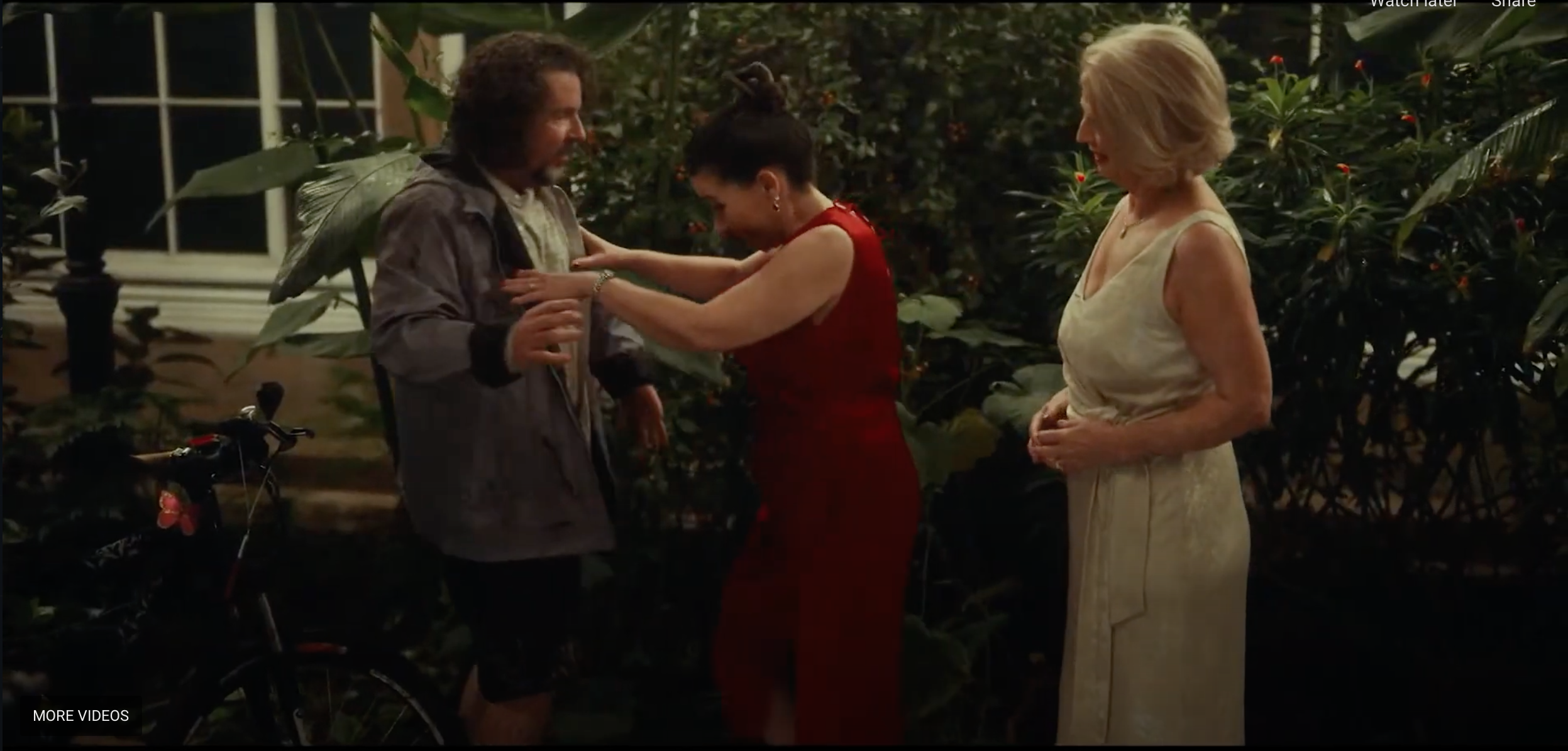
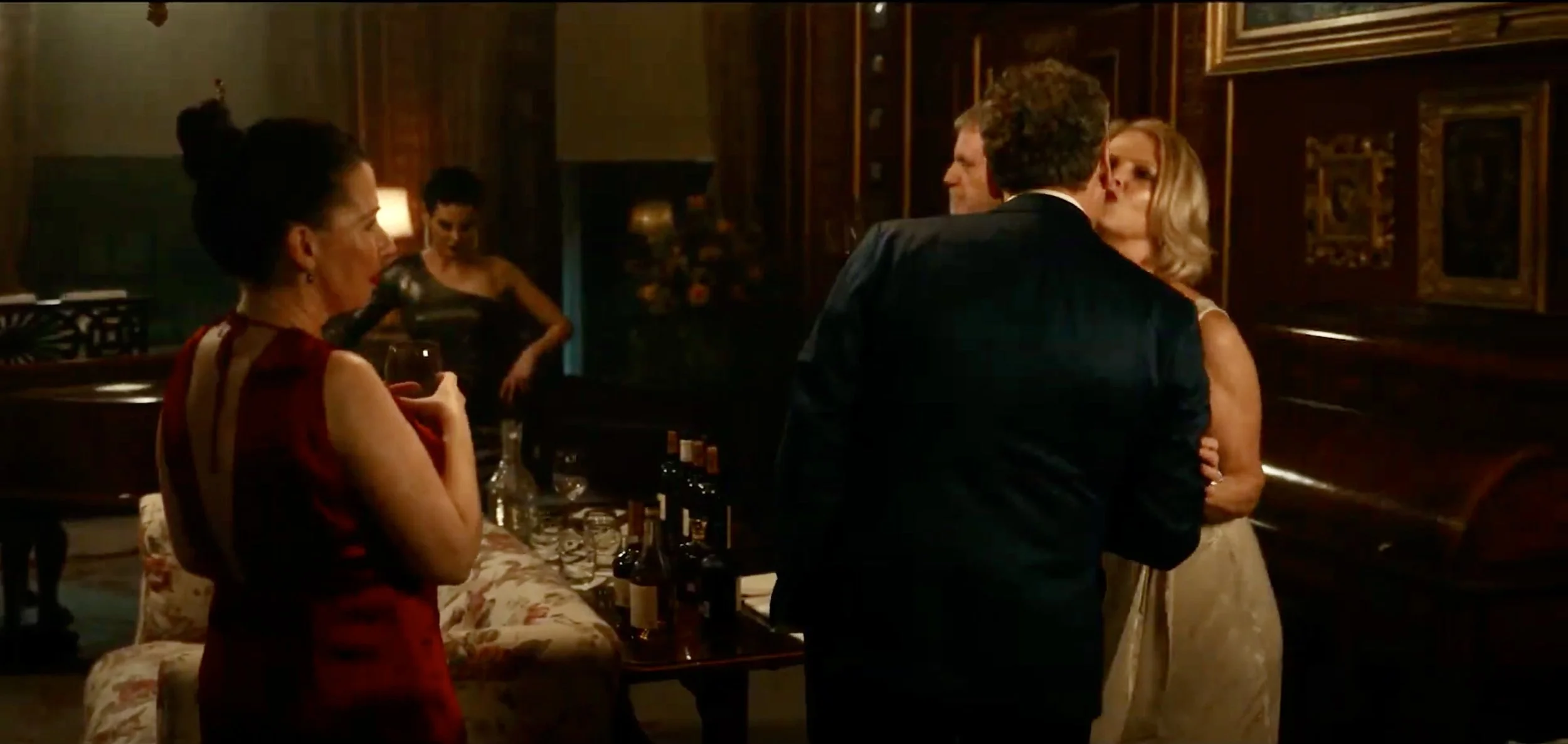
Our venue was a fantastic, furnished and expansive English Manor house owned by Roger Tempest, whose family has owned and lived in the stunning estate for 32 generations. The ensemble cast film - a Gosford Park-like (Altman, 2001) parody of friendship and decorum – was a relatable comedy/drama filled with obvious and subtle insights, double meaning and
CAADT GALLERY - Film Design Highlights →
embarrassing but all too real episodes of human behavior at their best and worst. My challenge was to combine the existing opulent historical décor with modern touches particular to our main characters to create a homey feel, then parallel the double meanings, richness and subtlety of the script in every production design detail possible.

CAADT (Lamprecht, 2021)
The lavish decor dating back to the 1500s allowed me to choose from an amazing existing rich colour palette of precious-stone shades in fabric, art and furniture: emerald green, ruby red, sapphire blue among others. The stunning textures, furniture, paintings and sculpture were available for me place, combine or remove at my discretion to best relate to both the psychological underpinnings of the story and many very specific dialogue references.
I familiarized myself with the options, preparing a detailed document for discussion/confirmation with our Director (10) after adding hundreds of my own design
pieces, from dishware to books, silver, trinkets, jewellery, clothing, fur and carpets, bathroom items, to paintings, framed photos and certificates, china and all the items one would find in a home.
My mood board (11) became rich with every element – both historical and current - that
might contribute to furthering our story’s symbology and meaning and create not just an opulent, but clearly personal home space.
On-Set Props by Room
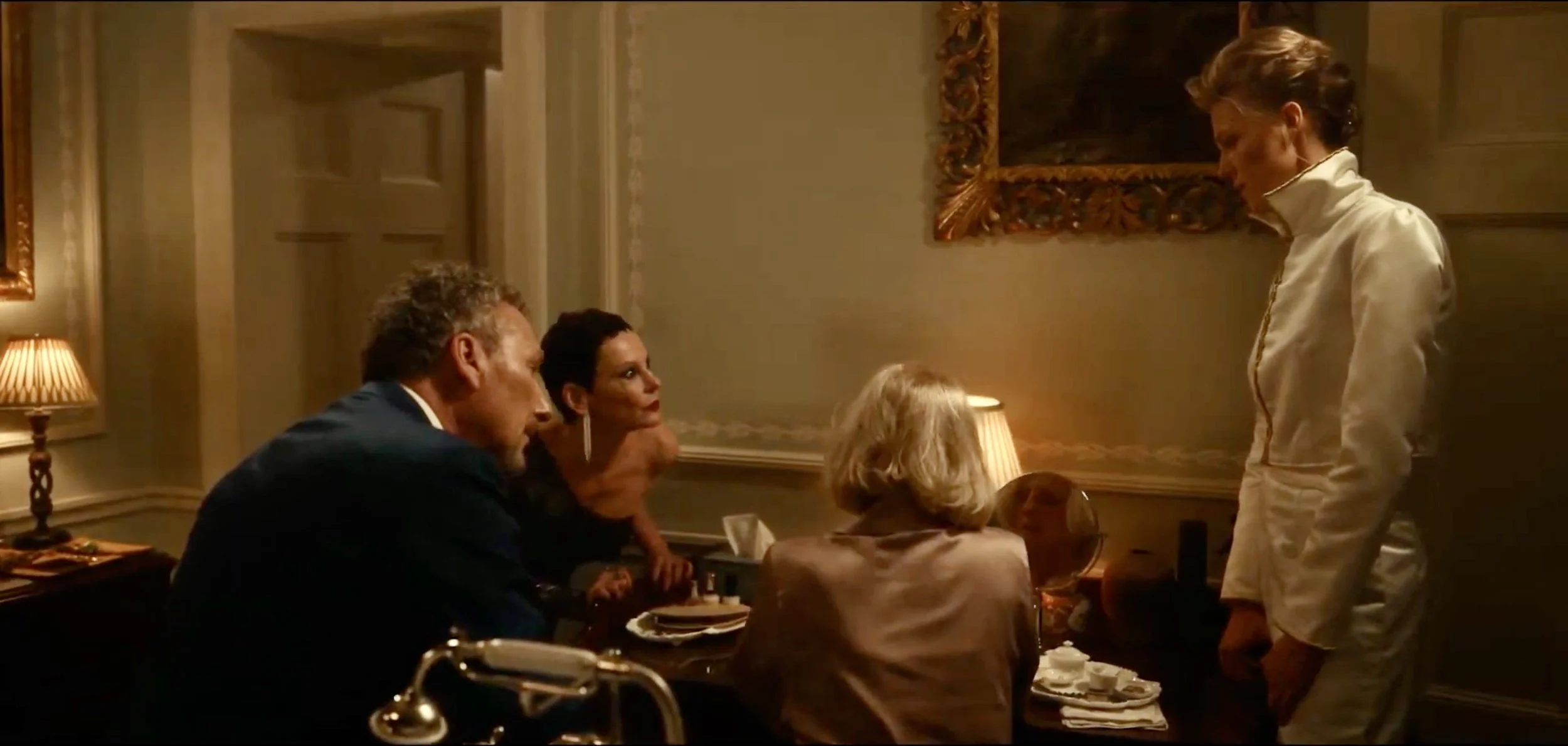
To make the MASTER BEDROOM & Bathroom look lived-in, I created small homey areas:
a desk area for one character, with classic love novels, an address book with pink (delicate femininity), green (abundance, growth) and white (purity) cards (her favourite colours in the story), a tea service for one - with partially eaten cookie (left for several hours to create rim of old tea – “detail within a detail” (LoBrutto, 2002) (6)
bedside reading glasses, sleeping mask, fruit plate with knife/cloth napkin/chocolate at each bedside, water glass and carafe, photos of the couple on his side, pens with Sudoku for one character


chair with men’s grey wool coat over the back and lilac silk scarf for him; mustard coloured leather purse with gold chain hanging with several evening dress cast-offs (pink and green) in silk on adjacent chair for her
closet filled with silk gowns, scarves; rear table with high-end English hats and evening purses
chair with tie options; pair of dress shoes below;
CD collection, books, champagne and DVDs on side chest of drawers;
flower arrangement (white – marital purity) in bedroom hearth to brighten the dark fireplace area and remind of purity and light;
bathroom make-up table for one character with lamp, mirror and numerous ornate containers, makeup and real jewelry including pearls and gemstones.

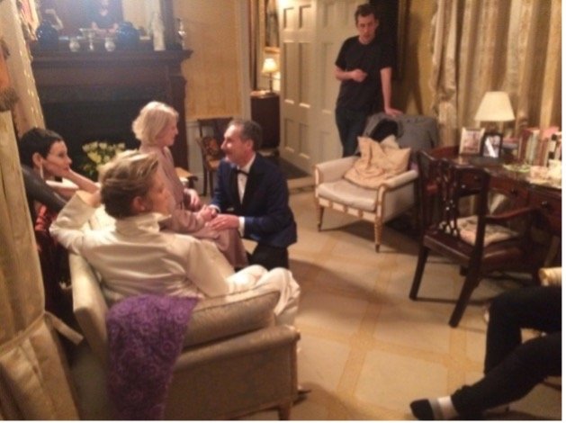


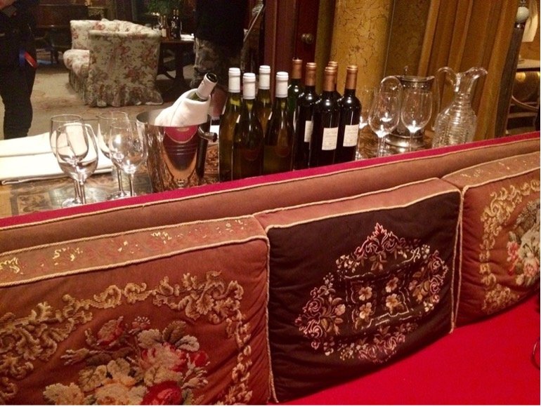
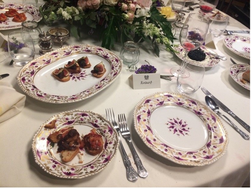
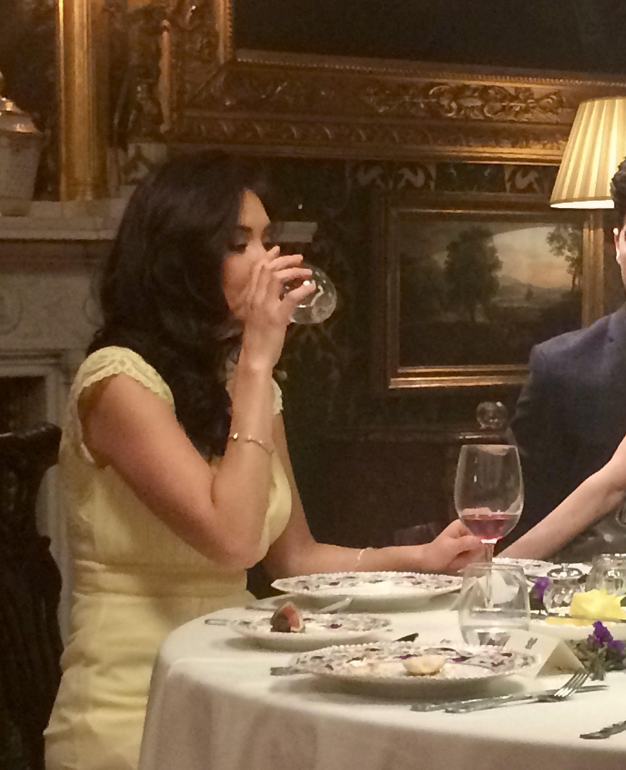
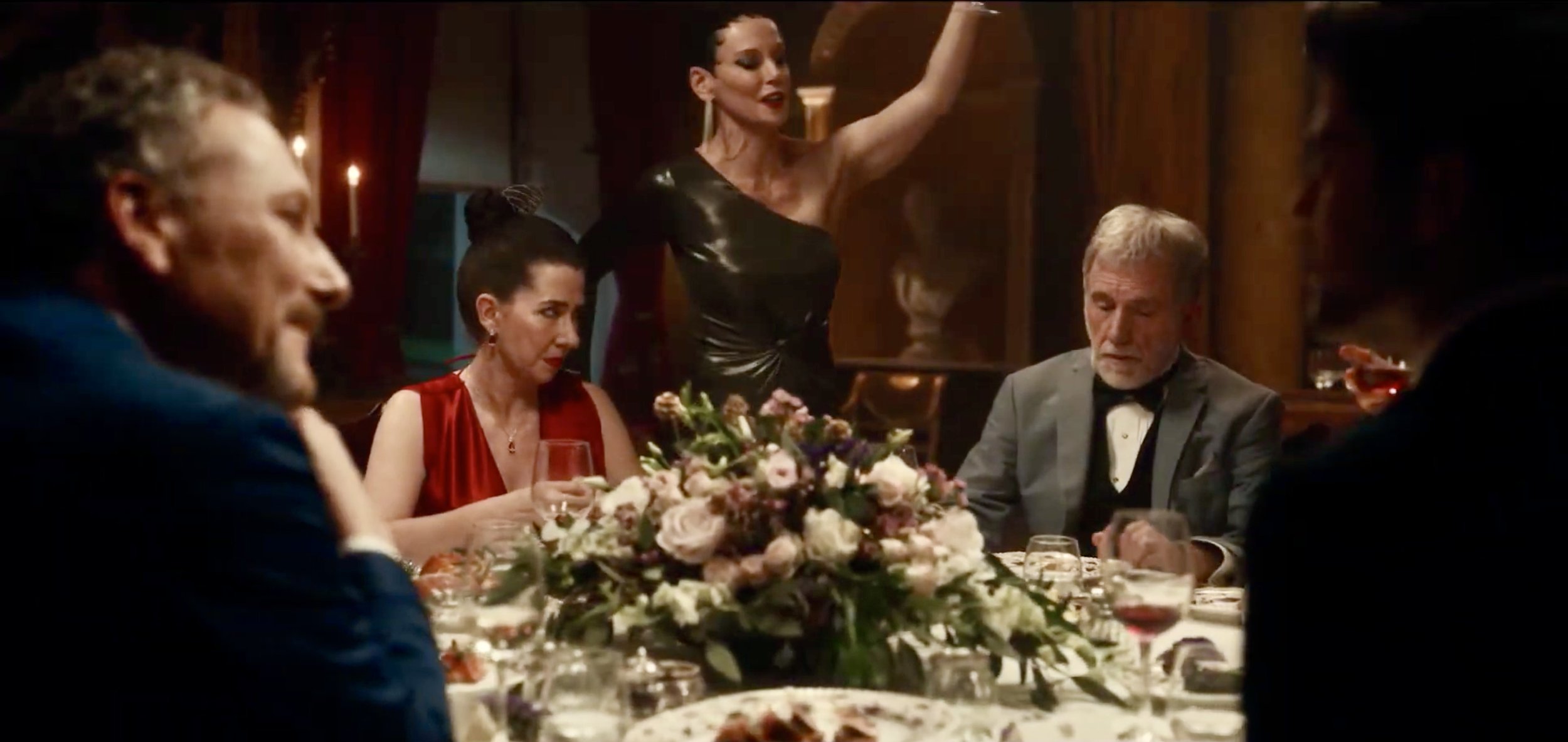
In the RED DINING ROOM, table cutlery was set English style with hand-painted burgundy and gold antique china (the colour symbols of love and goodness – like one of the key characters).
I chose a low table arrangement of flowers (for ease of face visibility in filming) on the circular table (as per Director for round-table filming) of the ‘guests’ in the style of Reservoir Dogs (Tarantino, 1992).
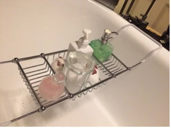
beautiful sink area (not pictured) with black men’s toothbrush, Italian toothpaste, black shaving brush on silver stand with razor;
beautiful matching china containers for toothbrushes, centre soap dish and candle, bath area in Marianne’s favorite pink and green;
Silk throw pillows on the bed and sofa to complement or contrast
Small bouquet of flowers in the bathroom

CAADT (Lamprecht, 2020)

Reservoir Dogs (Tarantino, 1992)
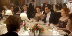
I referred to traditional table settings and low flower arrangements as seen in Titanic (Cameron, 1997) and Downton Abbey (Engler, 2019), and used extending branches on two sides to give the appearance of table ends (12). The colours were delicate shades of white (purity)
ivory (tradition), blush (delicate femininity) and nude (like the dress of one character), with delicate gold sprayed accents (paralleling another important character), and hints of purple (representing the most regal character of the group).
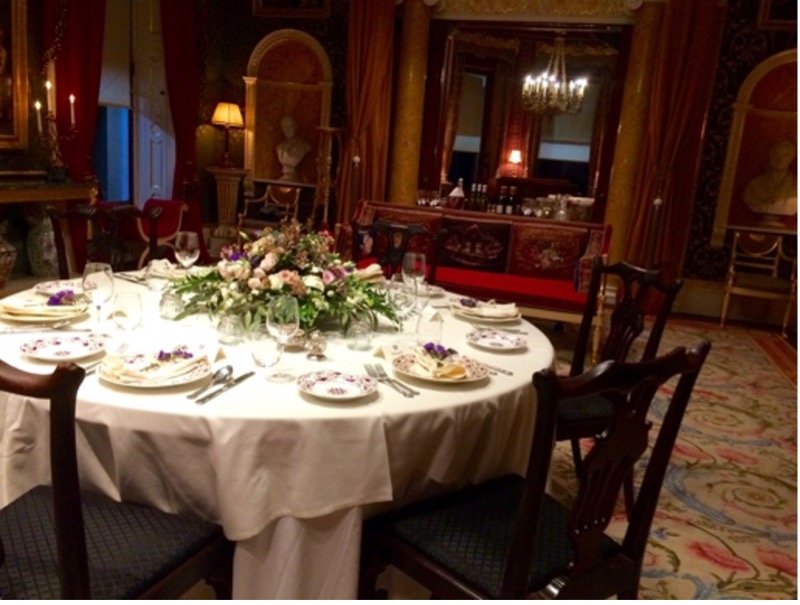


The flowers were predominantly full roses with smaller roses in between various ornate sprigs and delicate white freesias to give a sense of femininity, majesty and to not distract from the faces and dialogues of the guests – details and colour to further the symbology of the script and important metaphors in production design.
To solve the problem of creating a light grid without visible pillars and without compromising the view and curtains of the grand 24’ high room, I focused on cloaking trusses
placed at or by the curtains and/or existing pillars. I covered the trusses at the exterior windows in red fabric – a lighter shade than the existing hanging red curtain but in the same lighter colour as the existing antique ruby sofas. This allowed the maximum height to be seen in wide shots. I used a mustard-coloured velvet curtain on the other side between rooms, as this was adjacent to mustard coloured granite pillars and thereby more or less disappeared from view.

Although the room was massive and 24’ tall, no one could tell from the footage that trusses existed – hiding in plain sight - to accommodate lighting. We maintained unencumbered views of the curtains and valences at almost their full height.
(Our London, U.K. DOP Charles Heales texted later that he had received many compliments on his lighting, with his peers asking how the trusses could possibly have been hidden in such a tall and lavish room. He said I had done a fantastic job.)
To combat food spoilage and the need to replenish items for freshness and continuity, I had numerous exotic appetizers prepared – only two were actual, long-lasting edible ones for the ‘guests’, and the rest were just for appearances such as the one made from peppercorns and glaze (instead of caviar) (13). In this way we did not have to repeatedly make and monitor fresh batches of artistically prepared hors d’oeuvres.

Dinner was a dauphinoise potato slice, roast beef and asparagus spears beautifully presented with a drizzle of a dark reduction and sprigs of fresh herbs. I kept these fresh looking by refrigerating, and painting with olive oil or replacing entirely (once daily) as the shooting progressed.
I obtained permission from a kind and geneorus French vineyard owner/winemaker to use 2007 wine bearing the namesake of our story’s key character. This was a great story element and solution to labelling and copyright issues, allowing us to show a great volume on set– even in cases as in the wine cellar.
Using my calligraphy pen, I made place-settings for each guest, and an ivory ribbon (ivory representing one of the key characters) with a sprig of purple (representing another key character) for each fabric napkin on the plate before dinner. I chose an ivory tablecloth again, as a parallel to the traditional qualities of one of the characters, and equally to prevent unnecessary glare in filming.

I was not allowed to light the small tea lights in elegant votive candleholders I had placed on the table. This was done for lighting consistency as per our DOP. I regret that I did not push this point more strongly, as I still believe something was lost in not allowing the shimmer of a real flame at the table and on the faces of the characters as is so often used in films.

Every detail, like this butter rose, was meant to set this table - and the life of the key characters hosting the party - apart from any regular or usual home fine dining.

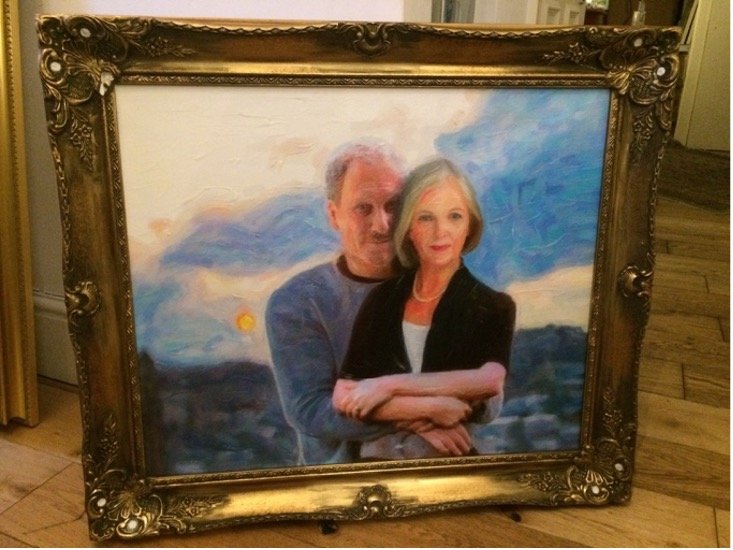
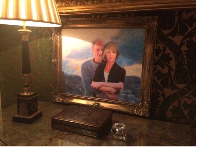
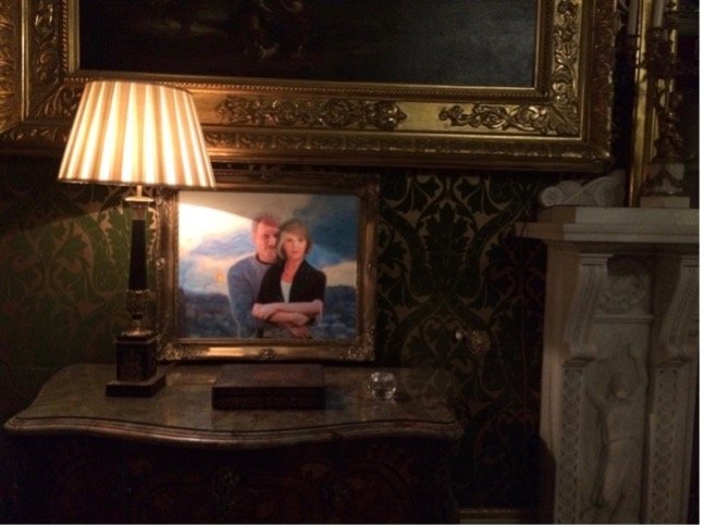
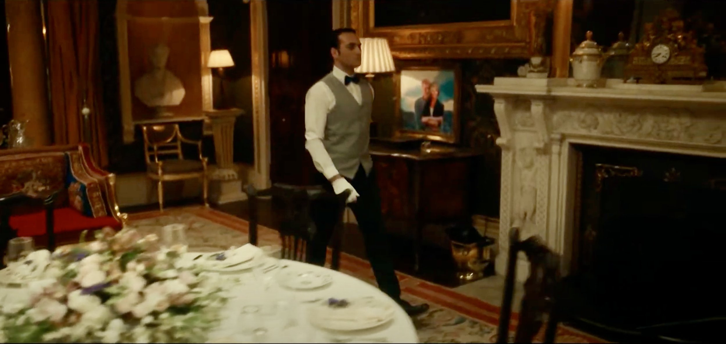
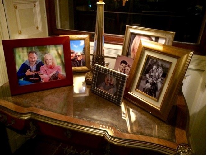
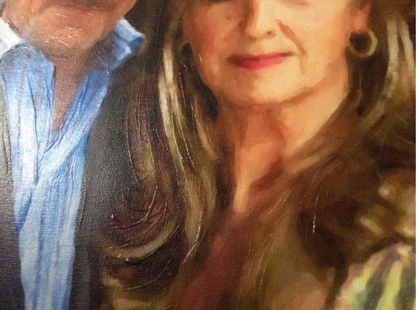
To personalize the home in every corner and differentiate it from the rented facility it was, I framed, for example, a contemporary painting of the couple embracing in front of the countryside of their home country . This was placed in the red dining room to the left of the fireplace. After photoshopping the actors’ heads over another photo, I changed the image into a painting-style treatment, printed on canvas, painted strokes in clear gloss and real paint overtop, then framed in a refurbished gilded frame I repaired.
On the other side of the fireplace was a similarly-sized framed landscape in the same colour scheme – majestic purples and blues like one of the key characters with traditional ivory, paralleling the qualities of the other. This created colour balance and symmetry in the room, another symbolic element key to the meaning of the story.
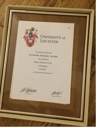
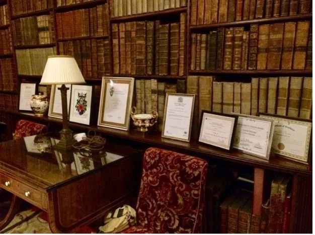
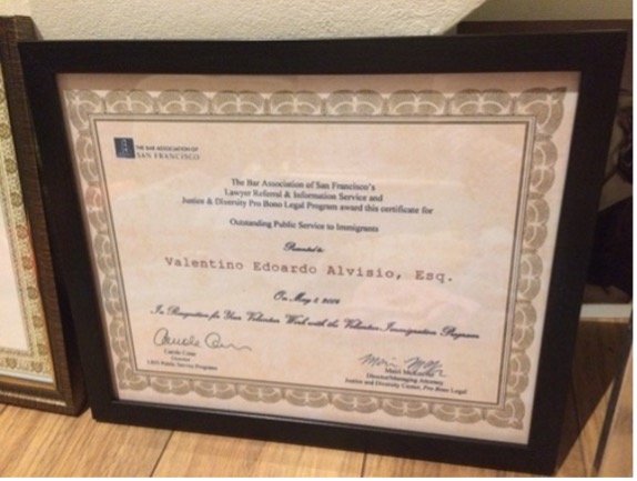
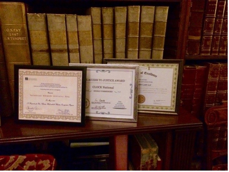
In the LIBRARY (the ‘home legal office’ of a key character), I brought in a large potted plant and many desk items including a globe, wax for his insignia impressions, file holders with files, pens/pencils and other table top items, magnifying glass, tray for files and a picture of his wife. Along one of the leather-bound book-lined walls (as there were no available walls for hanging), I placed a framed philosophy degree and law degree I made
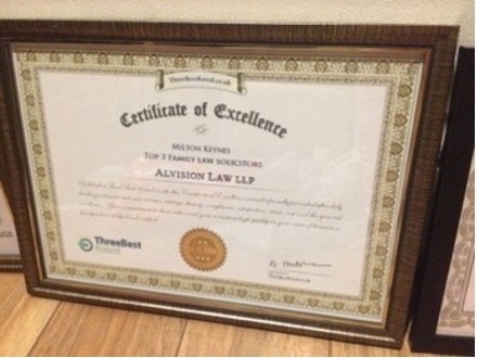
in photoshop from made-up universities. I created numerous framed awards and acknowledgments of excellence for this key character’s law firm. I named the law firm after the character, creating not only a twist on the his name, but creating a parallel in meaning to his role in the story.
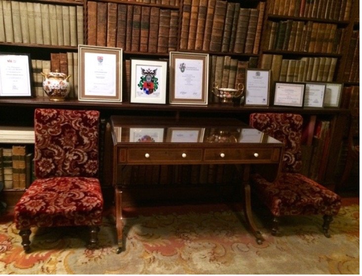
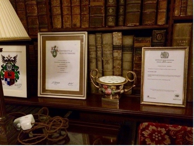
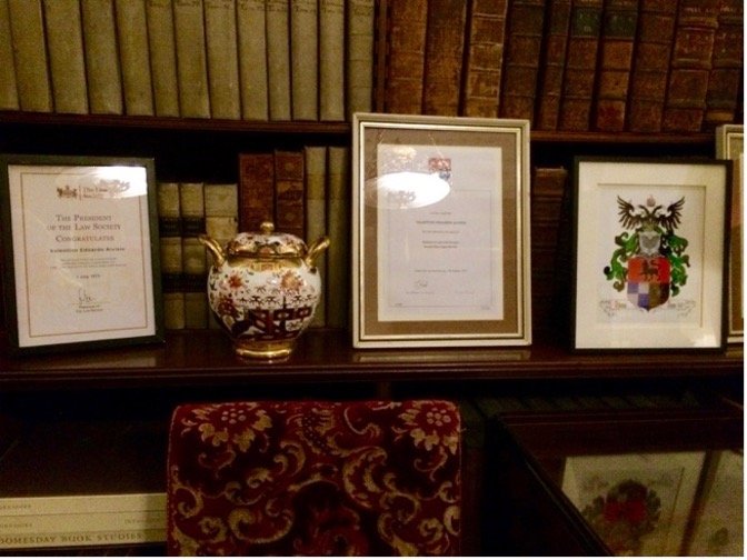
The family crest for the key couple I created, was placed there just as in the wine cellar of the namesake wine – again, a personal touch to ensure this looked like a loving private home.


I draped a beautiful silk embroidered shawl I brought across a chair, and a massive sheepskin (made of four skins) to create a cozy feel on the sofa by the fireplace, with a matching white sheepskin pillow. Without these many touches, the gorgeous historical premises would have maintained their museum-like, austere feel notwithstanding the
tasteful, high-quality diversity of furnishings and objects of art.
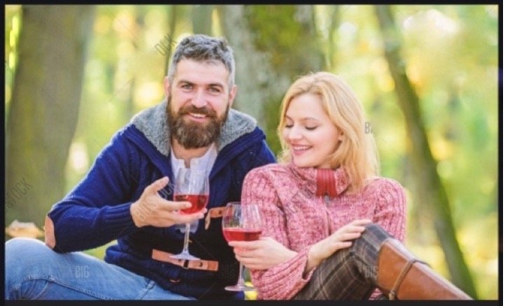
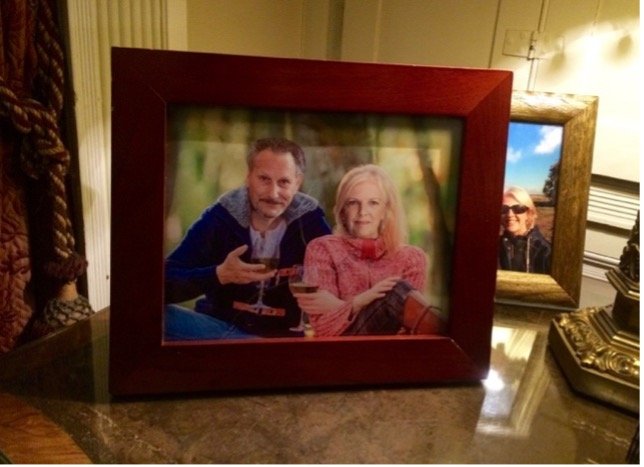
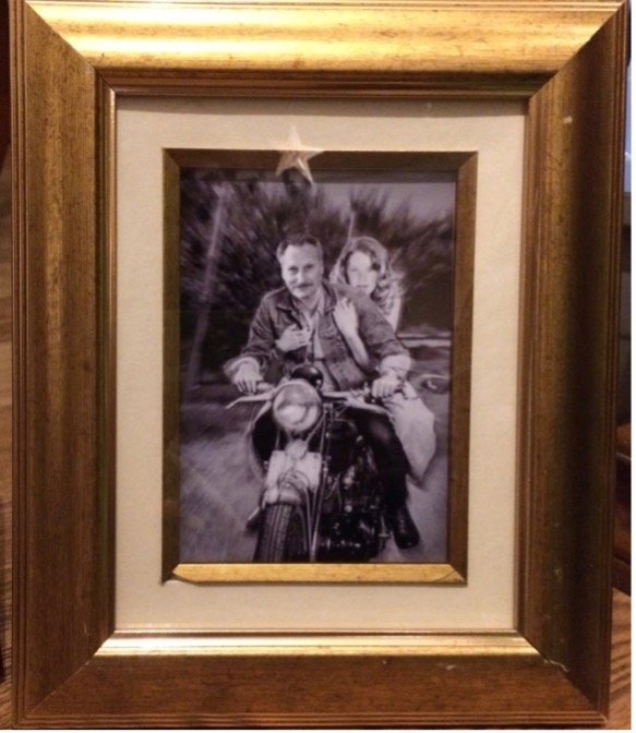
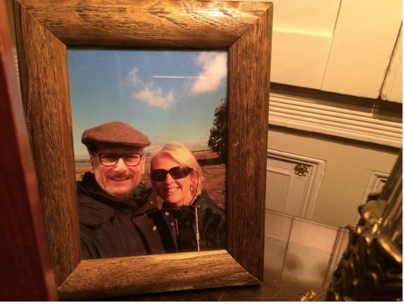
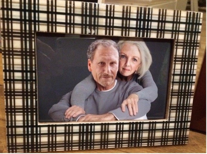
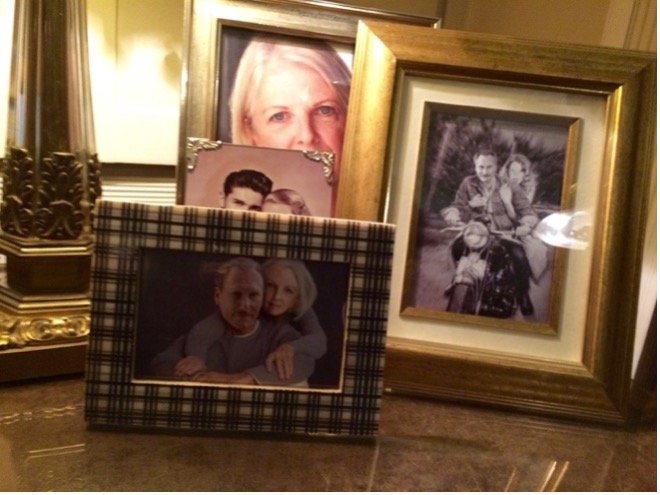
Across the room, one table was dedicated to photos of the couple - who in real life had never met. I used the scant couples photos provided by the actors where I could, relying mostly on a selection of the individual shots and stock photos I photoshopped with the heads of the actors, creating a visual history of the couples’ love.
In the FOYER, I created a majestic entry room fruit bowl in a 3-foot wooden vessel with metal embellishment I found in a charity shop, with an emphasis on grapes to foreshadow
the theme of a key character’s passion for wine - specifically red as would soon be revealed.


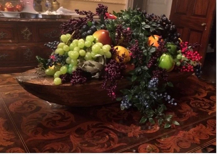
A red apple was strategically placed and easily replaced for each take of the upcoming scene where a key character dramatically bites in reference to specific well-known religious texts.
For the GREEN DINING ROOM scene (green representing abundance, fertility, new growth) where the ‘guests’ had now resolved their differences and harmony prevailed, I made a 2’x3’ formal ‘painting’ of the happy regal couple in the style of the hanging surrounding
historical guilt-frame paintings of ‘their’ ancestors. This provided a believable and personal backdrop to the festivities.
With the technique described earlier - photoshopping heads/details, applying ‘oil painting’ program, printing on real canvas - I again painted over in clear acrylic gloss to achieve the sheen, texture and line of oil paint brushstrokes. This was especially important here to match the surrounding real oil paintings. I used a drastically price-reduced damaged frame and repaired using putty and multiple shapings and sandings (to cut costs), then painted to match. The result looked entirely believable and fit right in with the other paintings and historical family members that adorned the walls.


I made an Italian Limoncello label in photoshop so that the label could be affixed to a real bottle and used for toasting on camera as is, without copyright concern.
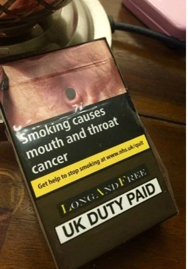
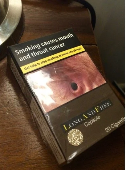
Unfortunately this was another details scheduled for the shoot, but that time did not allow.


I modified packaging for a ‘Long and Free’ cigarette brand I designed to combat copyright/label issues during the scene where a cigarette would be pulled from visible
sealed packaging. (I had replaced contents with herbal cigarettes with plain yellow filters to comply with smoking codes on-set prohibiting tar and nicotine).

In the CONSERVATORY, I overcame the issue of no blooms, by gently taping plastic blossoms and stems into existing plants.
I also strategically taped real orange berries to twigs, creating the illusion of happy understated naturally blooming plants for the dramatic entrance of one of the characters.

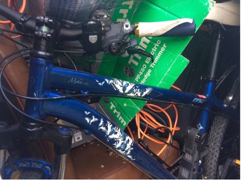
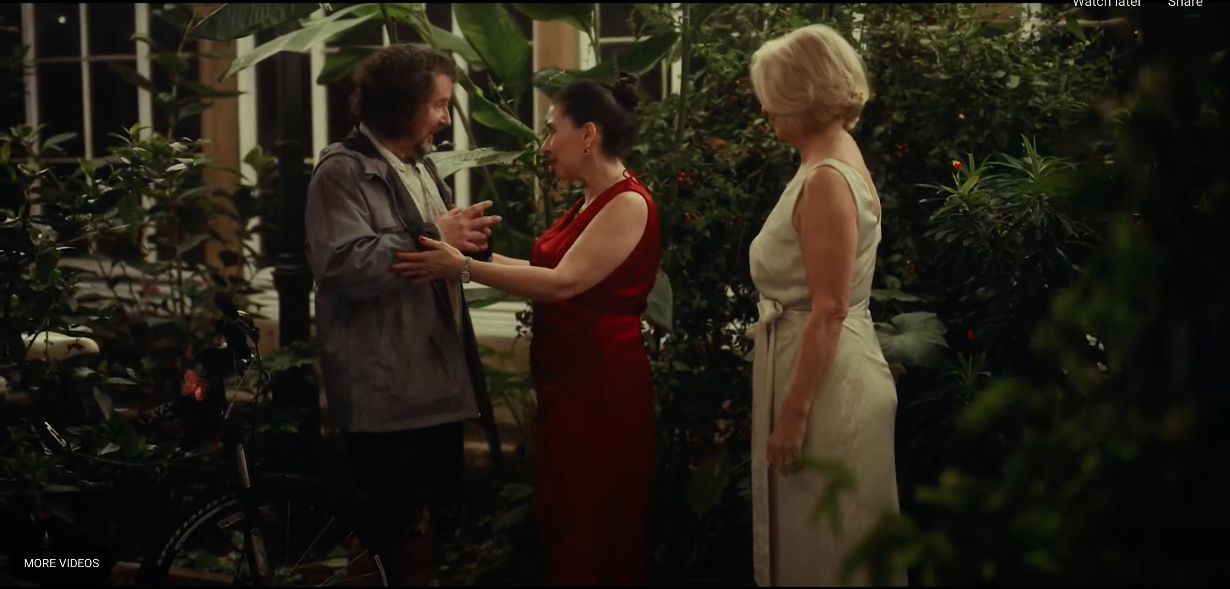
I had one awkward but lovable ‘guest’ riding a women’s bike with painted blue/white butterflies (just like the business logo of another character - his mentor and psychiatrist) as he arrived unannounced at the dinner party in progress. As well, his bicycle bore a pink butterly clip. The butterfly detail is an example of using production design to portray this character’s love of another, and furthering the story of their dynamic through production design.
I made up a professional business card and notepad for the psychiatrist character using a blue/white butterfly design with real but altered credentials, adding a special quote:
“It is a privilege to listen, reflect and cure”- traits the arrogant and entitled character in the story did not actually possess. This added comedy was another example of production design used with purpose to further the irony and humour.
This character’s business card was meant to be revealed when she opened her silver card case to sneak a hidden cigarette. Time unfortunately did not allow, and this detail was lost in the story.


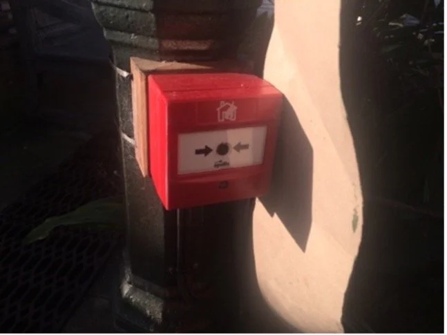
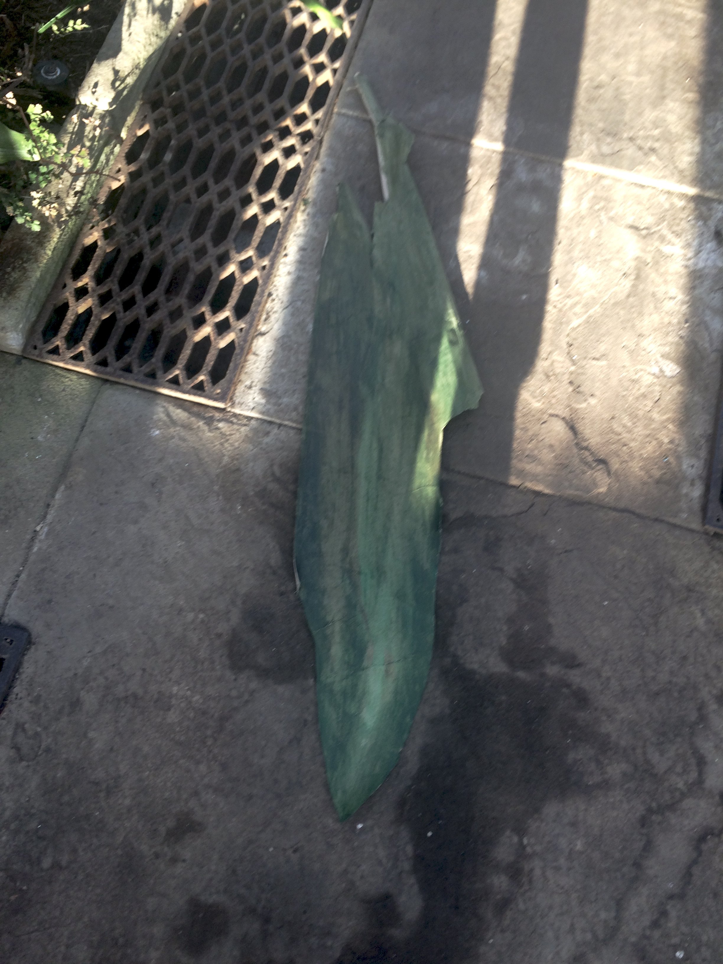
To hide a protruding bright red fire-alarm pull in a character’s entry shot into the Conservatory, I cut out and painted a large paper leaf with acrylics on extremely short
notice for a quick fix. I added the ‘leaf’ to an existing plant, disguising the red pull altogether (after trying to mask with black tape which did not look right).

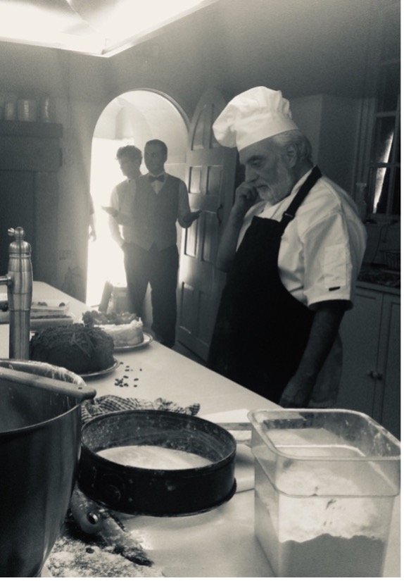
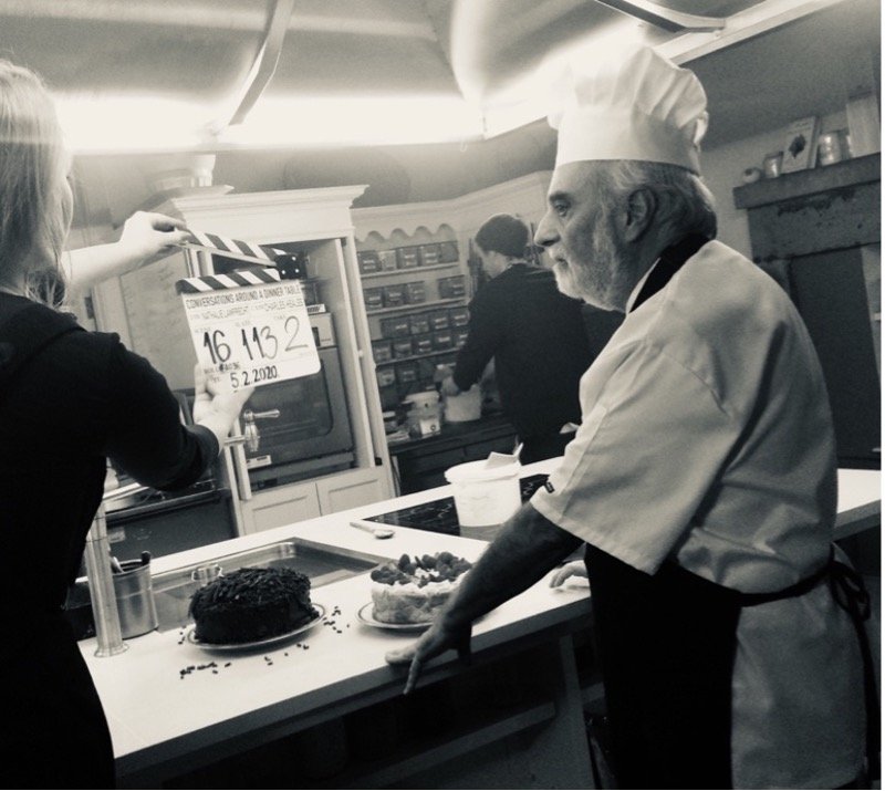
In the KITCHEN, I had two cakes prepared for the scene with the chef character - both paralleling a certain tension that was key to the theme of the film.
The kitchen itself was an actual functioning kitchen serving hundreds of guests for large scale events and rentals on the premises. I scaled this down by removing labelled items, stock of cutlery and any dishes suited for entertaining large numbers to create a smaller, more intimate kind of kitchen meant to serve a single family.
It needed to look like only the main couple lived there with a dedicated small staff. I added used utensils and dirty pans used for baking, with butter and flour strewn about as though the chef had just finished making his cakes.
The WINE CELLAR showcased the family crest I made in photoshop by combining several real crests, changing the colors, name and year. Cases of the real namesake label wine were there with full permission for use by their generous originator in France.
This again, solved the problem of creating a label or having to hide labels due to copyright issues, creating authenticity by sheer volume of bottles and wooden cases.


CAADT GALLERY - Production Design Highlights


CAADT - Filmography
Altman, R. & Balaban, B. & Levy, D. (Producers) & Altman, R. (Director), (2001), Gosford Park [Feature Film], United Kingdom & United States & Italy: USA Films & Capitol Films & The Film Council & Sandcastle 5 Productions & Chicagofilms & Medusa Films .
Bender, L. (Producer) & Tarantino, Q. (Director), (1992), Reservoir Dogs [Feature Film], United States: Live America Inc. & Dog Eat Dog Productions.
Cameron, J. (Producer) & Cameron, J. (Director), (1997), Titanic [Feature Film], United States: Paramount Pictures & 20th Century Fox & Lightstorm Entertainment.
Fellowes, J. & Neame G. & Trubridge L. (Producers) & Engler, M. (Director), (2019), Downton Abbey [Feature Film], United Kingdom & United States: Perfect World Pictures & Focus Features & Carnival Films.